

The Book's Looks: Part II
In celebration of some wonderful book covers and the people who make them.

When I was a child, I visited my aunt on Vancouver Island and we embarked on a quest that ended with a dragon. She wanted to buy me a copy of Tolkien’s The Hobbit.
I specified (in the fussy, determined way of adolescents, who turn their every youthful opinion into a worldview) that I didn’t like book covers with stills from movie adaptations or representations of characters from the story. Both impeded my imagination from taking off, causing my reading to stumble whenever my mental image of a character or scene in the story conflicted with the image on the cover.
My aunt and I searched through several bookstores before ending up at Munro’s Books, where we found the copy of The Hobbit that still sits on my bookshelf today. On its cover is a picture of Smaug the dragon.
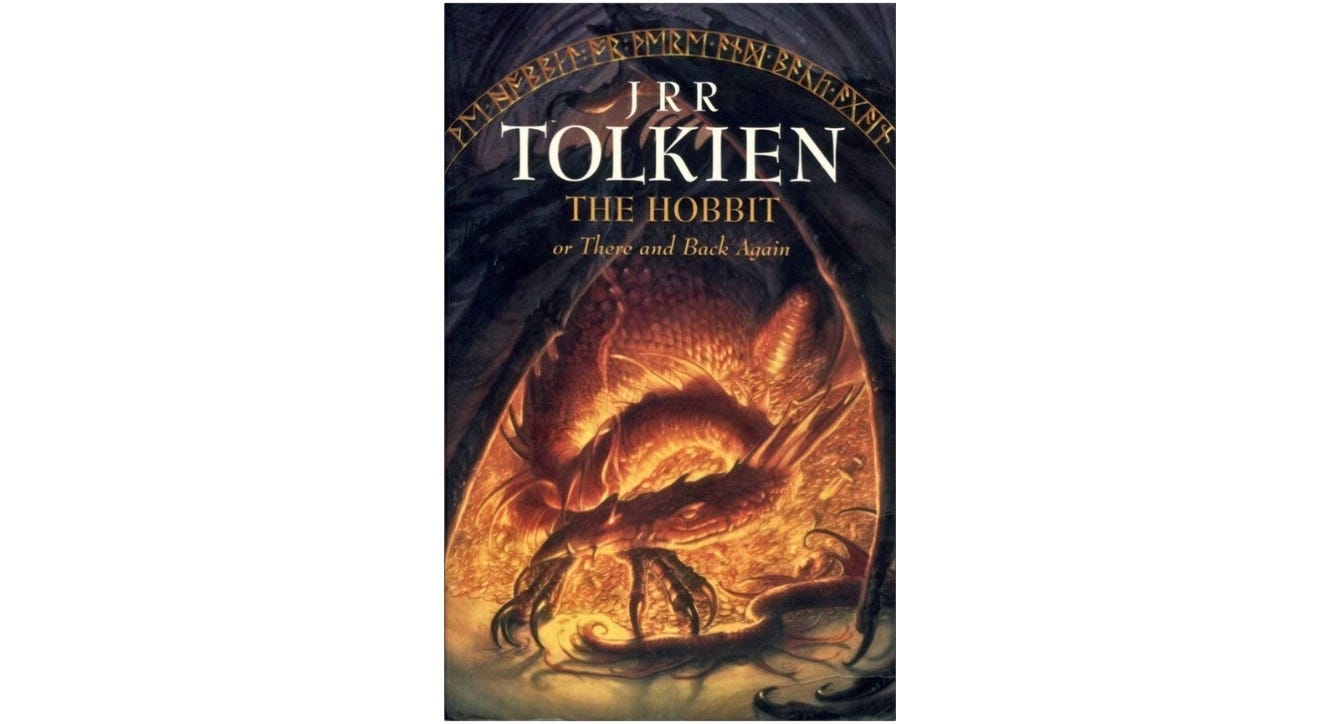
Despite contradicting my no-characters rule, I loved this cover. Holding that paperback in my hands, I anticipated the adventure it contained. I looked at that sleeping beast, curled inside his terrifying wingspan, glowing with internal rage and fire that illuminated the mountain of gold he guarded, and I felt like Bilbo Baggins — just as the Hobbit prepared to enter Smaug’s lair, I braced to enter the book. The dragon on the cover warned me of the danger inside and invited me in.
That cover was my first lesson in good design — that sometimes the obvious choice is right — and helped me see that there’s really only one rule that applies in all cover design: never judge a book by its cover, sure, but always judge a cover by its book.
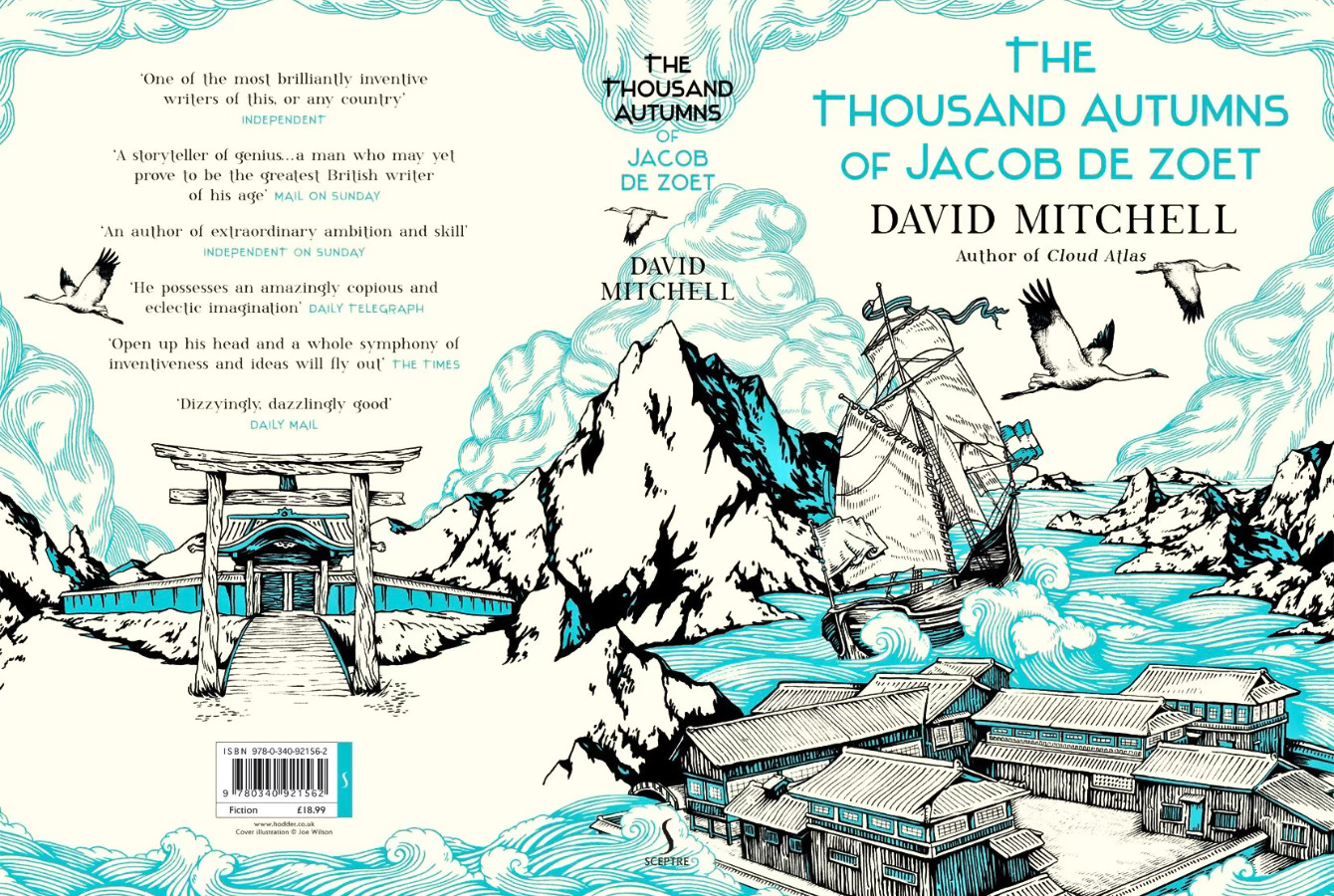
Having spent a while now in the world of book covers and their design — largely in the company of The Look of the Book, which I wrote about here — I’ve been giving some thought to the covers that work for me. Today, I wanted to celebrate a few of the designs that appeal to my tastes, with comments from the brilliant minds that brought them into the world.
