
The Book's Looks
What makes a great book cover, and what are covers supposed to do?

Like those reactionaries whose slogan is we don’t know what we’re for, but we know what we’re against, I can tell you precisely what I hate in a bad book cover, but I struggle to articulate why I like what I like.
For instance: No literal depictions of scenes from the story, please, and certainly no pictures of the main character. I understand trends in marketing and how they work, they just don’t tend to work for me. I don’t want to recognise a marketing strategy in the cover of a book. Broadness — having a generic quality — is another thing up with which I will not put. The graphic designer John Gall said, “A question I like to ask myself when designing a cover is: ‘Can this be the cover for any other book?’ The closer you get to a ‘yes,’ the worse off you are.”
However, ask me why I love a cover that I love, my answer will usually be: “Dunno, just do.” This deficiency was brought to my attention by reading the work of Nathaniel Roy on his fascinating substack, A Book Designer’s Notebook. (Seriously, check out what he’s doing over there; it’s become one of my favourite morning-coffee-reads and it’s well worth your time.) Impressed by his knowledge — and his ability to impart it entertainingly — I started looking more closely at the books filling my home.
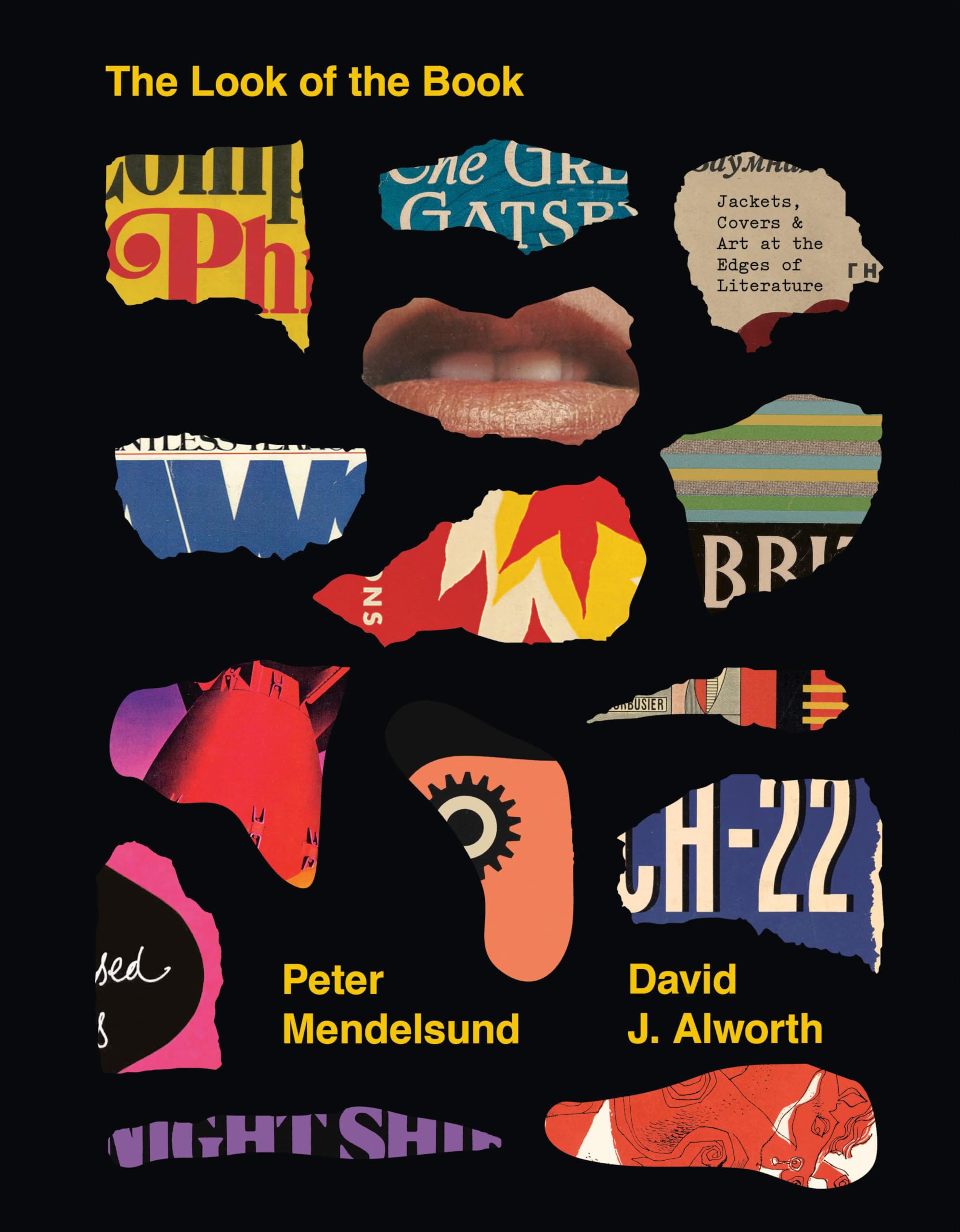
To guide my vision and thinking, I bought a book that I was led to by Roy’s substack: The Look of the Book by Peter Mendelsund and David J. Alworth. It’s from that book that I got this quote from the literary critic James Wood, which felt as if it were placed on the page just to ease my self-scolding for failing to assess the covers of books the way I critique their contents:
“I am struck by the paradox of my not reflecting very much on book covers generally and that at the same time, like most people, I have fairly strong likes and dislikes, opinions, and so on.”
Mendelsund and Alworth write that this unintellectual opinion-forming is par for the course with readers, but suggest that there’s more to be formed than mere first impressions:
“[Design] often operates beneath the threshold of conscious perception, influencing you without your knowledge, at least at first. Good design just ‘works’ and doesn’t demand critical scrutiny for doing so. But truly great design both works and stands up to scrutiny. Perhaps this is why the best book covers change with you as you read.”
Okay (I told myself) so your basic perception of book covers works fine — it turns out that it’s normal to “get” the cover without fully understanding it. But I wanted to go further, to be able to do that second part of scrutinising the design.
So, I read The Look of the Book, and I read more of Nathaniel Roy’s essays, and I pulled a bunch of books off the shelves in my study to really get to grips with what I’m actually paying attention to when I look at a book cover. This is just me and what I notice, not any kind of guide to the entirety of what designers are up to with their craft. For that — well, I’ve recommended the book and the substack. Read them and take a second look at the covers you most admire.
The Spine of the Book
“For the designer, this piece of real estate is both exclusive and cramped (think: studio apartment in the best neighborhood of a dense city). To make this space work, the designer must be shrewd, not only because the space is small but also because it will function as the outward face of the book for much of the book’s life.”
(Peter Mendelsund and David J. Alworth)
If I ask you to think about a book cover, or the design of how a book is presented, odds are you’ll think about the front cover. If I ask you which is the most prominent part of a cover, again you’ll probably think of the front, just as you likely will if I ask what you consider most when picking between various covers for a single book.
Except the front isn’t the part you’re going to see most often when you look at that book, sitting on a shelf in your home. For most of that book’s life, its most prominent feature will be the unassuming strip that sits between the show-off front cover and the information-dense back. It’s the spine of the book.
Cover design begins with physical space, and how much or how little of it there is. There’s the shape of the book to consider, three rectangles that make up the two covers and the spine. (Five rectangles, if the cover includes those sections that fold inside the book, where a synopsis gets printed on the front and author information on the back.) This is the first constraint that guides the design, and it’s most pronounced in that sliver between front and back covers.
The spine has some very specific tasks to accomplish with its limited space. As Mendelsund and Alworth put it:
“In addition to conveying essential information — author, title, publisher — the spine may carry an illustration from the front or back flap. In any case, the goal is to integrate the spine panel with the other parts of the jacket, while giving this narrow strip enough flair to make it stand out from other books on the shelf.”
The literal spine of the cover is also its spine in metaphoric terms, holding the whole thing together.
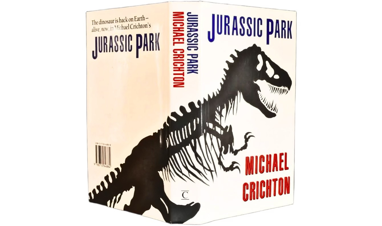
One of my favourite book spines is deceptively simple, yet remarkably effective. It’s from Chip Kidd’s design for the hardback first edition of Michael Crichton’s Jurassic Park. Kidd has said that the objective “was to make it look like a book about dinosaurs that hopefully didn’t look like any book about dinosaurs you had ever seen”. He avoided this primarily by stripping the T-Rex, the rock star of all mesozoic creatures, back to its skeleton:
“Since we were kids, we had all enjoyed ‘artists’ conceptions’ of what these animals might have looked like, but they inevitably came off as fake, because so much had to be built from the imagination. I decided to start with what was real, what we knew actually existed, and fill in just enough of the blanks to make it plausible yet unique.”
Avoiding representations “built from the imagination” also meant avoiding that cardinal sin in cover design: literal representations of the characters in the book. As for the text, which is the only other thing on that cover, Kidd said it was “meant to evoke park signage” — although, “to this day, I can’t remember why I put a black drop shadow behind his name. It looks needless and dumb. Who knows, maybe someone in sales said it needed to ‘pop more’.”
All of these elements come together in eye-catching simplicity on the spine, where you’re struck first by the salient information of title and author name, and second by the black stripes of what turn out to be bone against that stark white background. That glimpse of fossilised ribcage plays a subtle game with the eye. It’s not identifiable as anything on its own, so it makes you curious about what these sharp lines might be; once you read the title, it becomes clear, as if the lines have flipped to reveal what was there all along, that this is obviously part of some dinosaur’s skeleton. There’s not too much here, nor too little. It’s the Goldilocks zone of spinal design.
Finally, there’s also that subtle touch of visual humour: the dino spine on the spine of the book. Simple — yes. Silly — also yes and wonderfully so.
The Title
“At the outset of any project, the designer will want to make broad decisions, including the decision of whether lettering or art/illustration will be the main figure on the front cover. In other words, will the cover emphasize typography or calligraphy, or will it emphasize a visual image that the lettering must accommodate?”
(Peter Mendelsund and David J. Alworth)
In The Look of the Book, Mendelsund and Alworth write that “one way to achieve a memorable-looking book is through lettering”. Everything else can change on the body of each book in an author’s corpus — the image, colouring, title and other text — but a consistent typeface can be all you need to signal continuity, to reassure readers that, yes, this is another book from that author you love.
Aside from the striking colour filter put over Curtis Sittenfeld’s covers, her books are immediately recognisable from the typeface they share. To my untrained eye, it looks something like a bold Futura type, but it probably isn’t, though I don’t have to recognise the name of it to recognise it, if you see what I mean.
My wife and I were in a bookshop the other day, and she picked up Sittenfeld’s Romantic Comedy, which shares nothing in common with the covers of her other books, not even the colour grading scheme, except for the title’s typeface. She said, “This looks like it’s by that author you’ve read, the one who did the book about the president’s wife.” She’d nailed it simply because of the typeface.
Mendelsund and Alworth add:
“Of course, letters are not only constituent parts of words that communicate meanings; they are also shapes, patterns, and arrangements. […] If type is the star of the show, then the designer has many options for how to manipulate letters and words as shapes.”
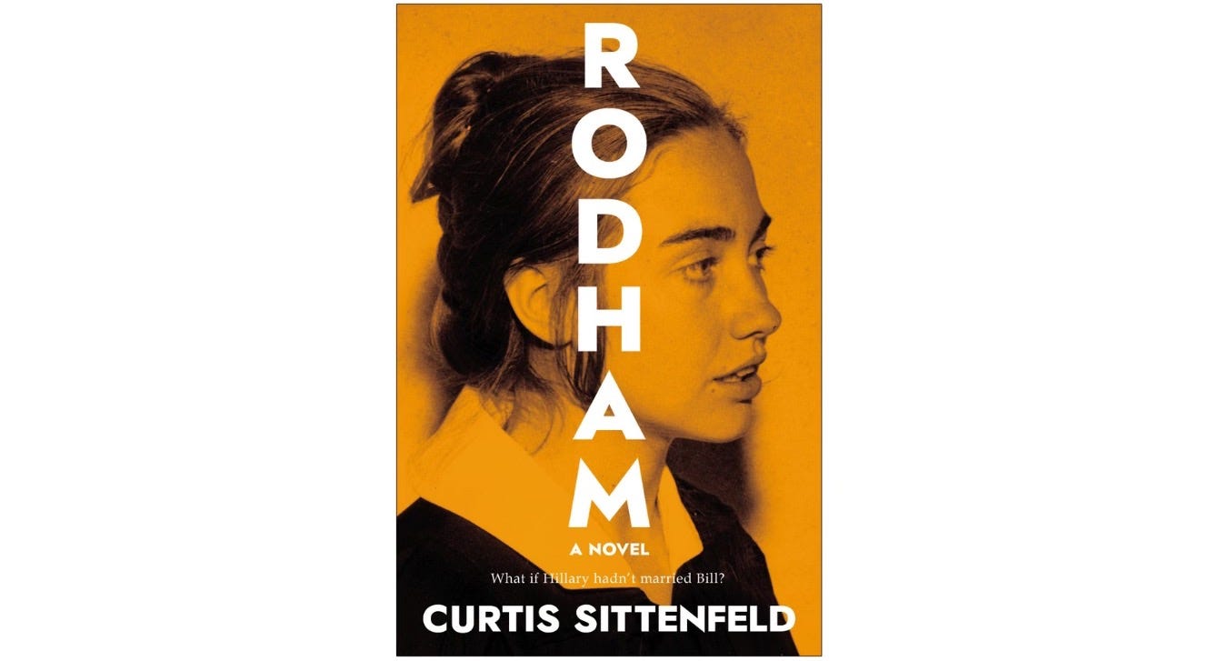
The title on the Rodham cover is doing this kind of work, communicating more than its pure textual meaning. By running vertically down the centre of the cover, the title interacts with the horizontal plane of Hillary’s head, turned to the side, to create a kind of “cross”. There might be some intentional symbolism here (is she a martyr?) but even if not, it captures the eye simply as a shape.
If your inner sceptic wasn’t turned off by that bit of visual criticism, allow me a little more: by turning the text from the usual left-to-right direction to the less ordinary top-to-bottom, the title implies an upending of norms, an ordinary thing turned on a new angle to be different — much like the Hillary of this alt-history fiction. Here, the presidential candidate never became “Clinton”, and this fictional slanting of reality is reflected in the strange directionality of the title text.
That one-word title is really doing a lot.
The Cover Image
“A good book cover is an invitation to a journey that offers some indication of what it might be like to travel into a given storyworld.”
(Peter Mendelsund and David J. Alworth)
Klara and the Sun has the kind of cover that’s instantly irreplaceable and a part of the book’s DNA. I can’t imagine Kazuo Ishiguro’s novel dressed any other way, and I wouldn’t want to read it with a different cover. The burnt red, Mediterranean green-blue, and that glimpse of yellow are wonderful each on their own, but the relationship between them feels inevitable in the best kind of way. As if these three colours must have always been together.
After creating this beautiful design, Peter Adlington redesigned the covers for all of Ishiguro’s books. He kept the window device in the centre of each cover and set out to design the images that they would reveal.

“When we sent the visuals to Ishiguro,” Adlington says of the Never Let Me Go design, “he chose the most detailed illustration, the tape, as the cover.” At first, he worried that the detail in how the cassette was drawn might clash with the simplicity of Klara’s yellow sun, but he soon saw that the window and painterly colours offered enough cohesion that he could take more liberty with the images.
After Never Let Me Go, Adlington turned to The Remains of the Day. (We should all turn to The Remains of the Day — it’s as close to perfect as I’ve seen a book get.) This time, he made the image fade, a visual touch that moved even further from the block colour simplicity of Klara. It’s a touching nod to the central conceit of the novel, its major theme, and the state of our narrator all at once. “The idea behind all the covers was to provide a brief snapshot into the book, conveying some emotion and narrative.”
Adlington’s far too modest about what he’s achieved with these deceptively simple images. They all have what’s described in The Look of the Book as a “timed-release quality”:
“The most interesting book covers are those that, no matter how ornate, hold something back, requiring you to finish the text in order to ‘get’ them. They feel less like tricks and more like wonders, revealed slowly through an interplay between the author’s words and the designer’s vision. They have a timed-release quality: they change with you as you read, and their meaning arrives later.”
Take the image for The Remains of the Day. If you read the synopsis on the back, you’ll understand why there’s a man in a bowler hat on the front. It’s enough that it’s not confusing, it’s even broadly apposite. But it’s not until you’ve finished the book that the fade effect makes sense — more than that, it hits you in the gut. Same with the yellow circle on Klara and the Sun, the title of which explains what the circle is; it takes reading the book to understand the square window and precisely why, of all things, the sun is a perfect distillation of the novel in both its plot and its themes.
This talent for distilling a book to an essential image is one that marks out a great cover design. It goes well beyond illustration, creating something new in relationship to the text it builds on. The writer David Sedaris compares a great book cover to “a great Spanish edition” of an English-language book:
“The designer takes the manuscript and deftly translates it into a language I understand, but am unable to speak with any clarity. How on earth did you do that? I think when I’m given the finished product. To take 70,000 words and turn them into a single image. How is that not a miracle?”
Blurbs
“Books also need to sell themselves, so covers can be understood as teasers, functioning much like movie trailers, giving us just enough detail — including comments from other readers, known as ‘blurb’ writers, whose praise is in fact promotion — to entice us to buy the book.”
(Peter Mendelsund and David J. Alworth)
Never trust a poet.
They will reheat the leftovers of a relationship for public consumption, dramatise secrets shared in confidence, and their instinct for self-promotion often comes at a cost they don’t mind sharing with others.
Exhibit A: Walt Whitman.
The poet (relatively unknown at the time) received a private letter of praise from the far better known Ralph Waldo Emerson, who’d read a first edition of Leaves of Grass. Like a vulture scavenging scraps from the carcass of a once-beautiful creature, Whitman tore his favourite line from that private letter of support — “I greet you at the beginning of a great career” — and had it stamped on the spine of the next edition of the collection.1 Thus was born the blurb.
Blurbs (also known as pull-quotes) are those snippets from glowing reviews — which so often read as obsequious or glib, however well-intentioned — that get pasted all over the covers of good and bad books alike. The term comes from Gelett Burgess who, in 1907, created a parody book jacket making fun of the increasingly common practice of what she called “blurbing”.
Her derision has been passed along to us through generations of scornful writers from George Orwell (who blamed the novel’s decline on “the disgusting tripe that is written by the blurb-reviewers”) to Camille Paglia (who said blurbs are “absolutely appalling”) But blurbs do matter. At least, they matter some of the time for some people. Let me try to rescue that fatuity by making it more concrete, more specific.
I find in spite of myself that I never fail, when picking up a new book in a shop, to let my eye roam noncommittally across the list of blurbs on the back of a novel. Except I’m not really reading the quotes. Instead, I’m looking out for two things:
Who the quotes are from,
and
Original phrasing.
For 1, I’m looking for signifiers of something beyond the story or the stuff that publishers and publicists think will sell the book. I’m looking for clues about the kind of book it’s going to be. As Rebecca Makkai put it in an article (about why she’s no longer blurbing):
“A book blurbed by Salman Rushdie and Zadie Smith is going to be very different from a book blurbed by Stephen King and Louise Penny, which will be different from one blurbed by Jodi Picoult and Jacquelyn Mitchard.”
Apart from delineating kinds of book, the who’s-who of citations on a cover can also tell you something about the standard of the book in question. If I’m considering some new horror novel (a genre I’m fairly green about) and Stephen King has stamped his approval all over the back cover in superlatives about how he wishes he’d written this book, it seems like a safe bet to take a chance on it. Franzen saying that a sci-fi novel made him want to try his hand at the genre would be another kind of interesting that would make me swap cash for the hardback in hand.
When it comes to 2, I’m searching for something authentic in a practice that — because of its ubiquity and hyperbole — often seems insincere. Most pull-quotes could be slapped on most books, and most of the words they use are dead and dull. The phrase tour de force no longer has any force; likewise, we should put a ten-year moratorium on any adjective that has no more specificity than meaning a high degree of “I liked it”. Brilliant, wonderful, compelling, and outstanding will all have to go.
Instead, I look for an expression of intimacy between the reviewer and the reviewed, some hint that the critic had an authentic experience reading the book. These are the only recommendations that matter to me — the ones that feel as if the person has had to reach deep into their soul to find an honest expression, even just a word, worthy of this book. I want to read anything that affects other readers this way.
What about the use of blurbs in cover design?
Much like blurbs themselves, their use in cover design is often uninspired. They usually sit beneath the synopsis on the back cover, sometimes with the most bombastic or the one from a prestigious outlet like The New York Times adorning the top of the back cover. If it’s a hardback, you get to watch other book-buyers flip the book over, sigh frustratedly at discovering there are only blurbs on the back, which they have no interest in, then turn to the inside flap for the synopsis, which was all they wanted in the first place. You can always spot a paperback reader this way.
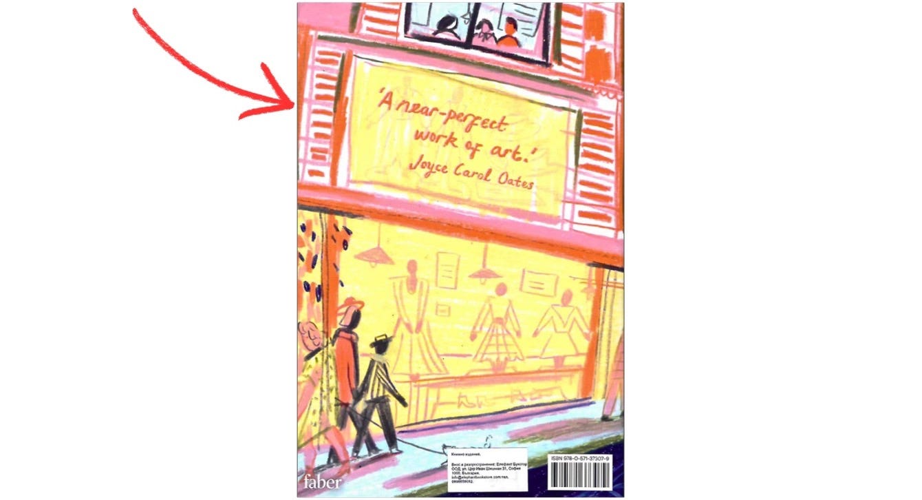
Occasionally, but only occasionally, a designer plays around with the placement and layout of blurbs in surprising ways. I know I’ve seen them, but I’m damned if I could find many for this essay. While I was writing the first draft of this piece, the postman delivered a secondhand book I’d bought, and the first thing I noticed on its cover (which has a lot to be noticed; it’s a fairly busy design) was the blurb near the top:
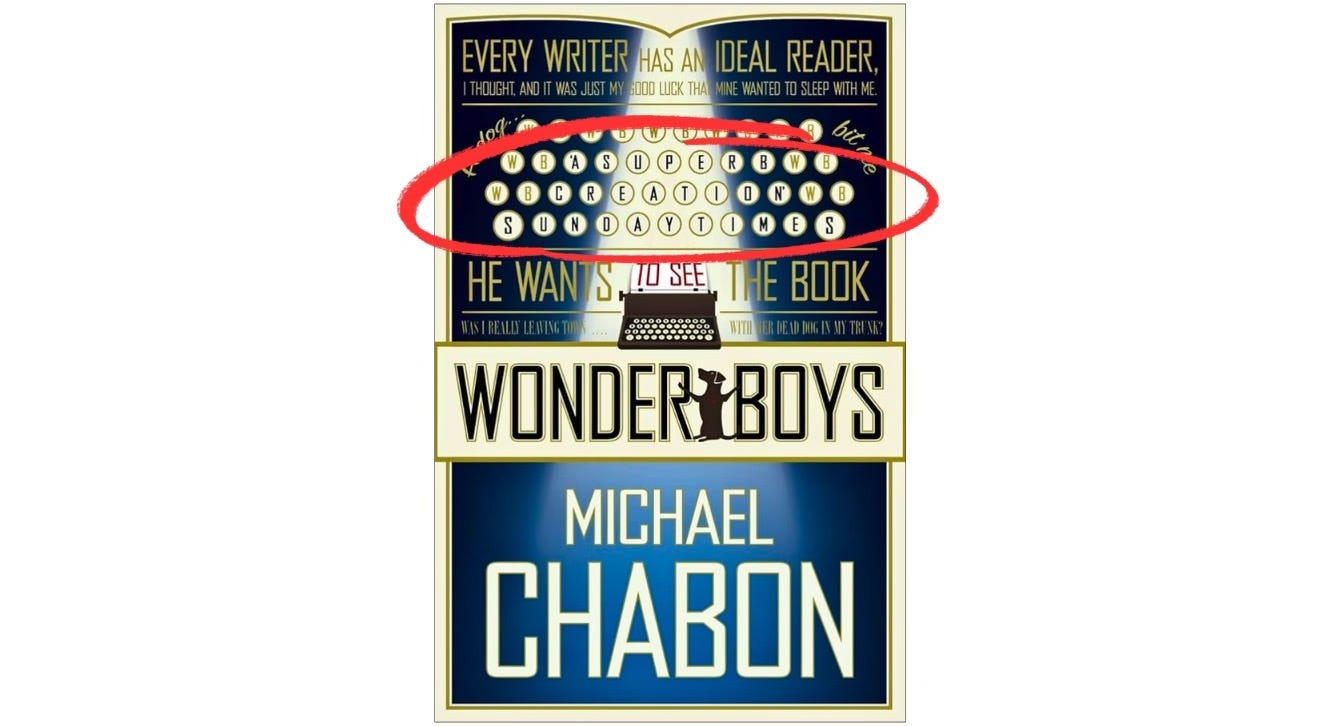
It’s a pretty maximalist incorporation of a blurb into the cover design, and I’m not entirely convinced it works, but I have to admire the swing. (It reads: ‘A SUPERB CREATION’ SUNDAY TIMES.)
There’s also Beya Rebaï’s redesign for Sylvia Plath’s The Bell Jar. I kind of love how she incorporates a single blurb into the image. As a pull-quote it’s business as usual, but as a piece of design it’s clever and attractive. The typeface and angle of the blurb pulls the text into the image, so that it becomes almost diegetic. The blurb seems like it’s written on the glass of the shop window, like it’s part of the advertising display.
As a reader handling the novel in a shop, this single blurb and its relationship with the rest of the cover design had more sway over me than the reams of bombastic praise listed across the backs of so many other books. This is something I’d like to see a lot more of in cover design (assuming we don’t just do away with the blurb altogether, which I wouldn’t hate), so if any of you, dear readers, find other interesting blurb design on your travels through bookshops, send them to me. It turns out that once you start noticing more closely the covers of books, you don’t want to look away.
“[The] book cover is a prime example of what poet Ezra Pound called a ‘luminous detail’: a bright spot, in a crowded cultural field, that enables us to see the world in a fresh way. That is, if we pause long enough to ponder it.”
~ The Look of the Book
Whitman’s choice of line to cannibalise from Emerson’s letter is fascinating. Every sentence reads like the blurb every writer wishes they could plaster on the front of their book. Whitman might have promoted his collection with “the most extraordinary piece of wit & wisdom that America has yet contributed”, or “It had the best merits, namely, of fortifying & encouraging”, or any number of buzzwords like “wonderful”, “extraordinary”, or “brave”. Instead, Whitman samples the line about his being “at the beginning of a great career”. He amplified the praise about him rather than about his poetry. The first blurb, it turns out, was more about selling an author than selling a book.
Here’s the letter in full:
Dear Sir,
I am not blind to the worth of the wonderful gift of Leaves of Grass. I find it the most extraordinary piece of wit & wisdom that America has yet contributed. I am very happy in reading it, as great power makes us happy. It meets the demand I am always making of what seemed the sterile & stingy Nature, as if too much handiwork or too much lymph in the temperament were making our western wits fat & mean. I give you joy of your free & brave thought. I have great joy in it. I find incomparable things said incomparably well, as they must be. I find the courage of treatment, which so delights us, & which large perception only can inspire. I greet you at the beginning of a great career, which yet must have had a long foreground somewhere, for such a start. I rubbed my eyes a little to see if this sunbeam were no illusion; but the solid sense of the book is a sober certainty. It had the best merits, namely, of fortifying & encouraging.
I did not know until I, last night, saw the book advertised in a newspaper, that I could trust the name as real & available for a post-office. I wish to see my benefactor, & have felt much like striking my tasks, & visiting New York to pay you my respects.
R. W. Emerson
Matthew, I am likeminded! I will not even pick up a book with an ugly cover when I'm browsing in a bookstore. For many years now, I have made the observation (and I am not alone) that British book covers are usually more attractive to me than American ones. For example, when The Mirror and the Light was published, I ordered the three volume hardcover set of the Wolf Hall trilogy from England because I liked the design better than the American version. Also, I ordered the paperback of A Place of Greater Safety from Blackstone's recently for the same reason.
Beautifully written and totally absorbing. The reading world needed to know this! For many years I have been a bookcover admirer and have been known to buy a book just because of the cover design. My pet hate is incorrect artwork, e.g. the dog was black but illustrated brown, the house was green but illustrated white. No accounting for design tastes but for me it lowers the authenticity.