

The Look of the Book
On book covers, in the words of the people who make them.

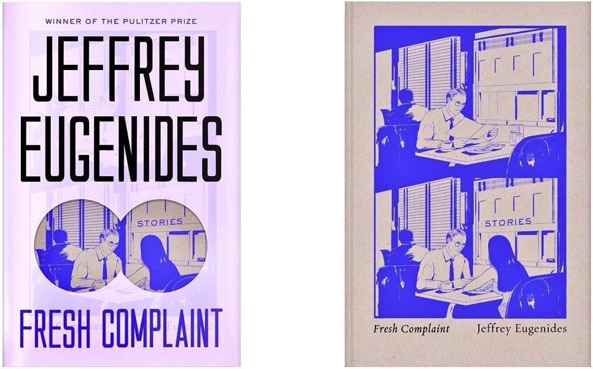
When Na Kim was offered the chance to design a cover for one of her favourite writers, Jeffrey Eugenides, she took the job with daydreams of instant glory. But Eugenides rejected her first design, and her subsequent swerves to correct the speeding car of her enthusiasm sent her into a spin.
“Embittered,” Kim says, “I started bargaining with myself through cheap edits. Surely, italicizing the subtitle will do the trick. No? How about making it sans serif?”1
All that got her was two more weeks of rejection.
Finally, she begged her boss for guidance, and he asked if she was designing something specifically for this book, or maybe she was “just trying to make something cool?”
“Having been forced to confront my own narcissism, I sheepishly mouthed a near-silent ‘no,’ and shuffled back to my desk in embarrassment. I’d been exposed. I had put my wants and ambitions as a designer ahead of what the book actually needed. […] I wanted to make a beautiful book jacket, but had forgotten why. I reminded myself that a well-designed book jacket ultimately serves the book it’s made for.”
Kim decided to step away from obsessing over the end result and spend more time with the process.
“At first, it felt counterintuitive to waste more time away from the cover, but I knew what I really needed was a palate-cleanser. So instead of returning to the cover at large, I decided to draw for the rest of the evening. In the following weeks, I stopped feeling sorry for myself. I remembered how lucky I was to be here. I re-read the stories and the author questionnaire that I’d been graciously provided with. I went through a few more rounds, this time listening to the editor and author’s input.”
Eventually, this led to a huge, if unexpected, success for Na Kim.
“The end result was a far stretch from what I had originally envisioned, but the publisher, author, and I were all pleasantly surprised by the outcome.”
The wonderfully fresh cover she gave Fresh Complaint was a playful, minimalist design, complete with a sexy purple slipcase I couldn’t say no to even when a much cheaper paperback was also on the counter.
Cover design is a process, a truth that gets disguised by the finality of the finished product. Plus, who doesn’t love the idea of divine inspiration, genius that manifests in a pure eureka! moment. Mostly, though, there’s a journey that’s sometimes a marathon, sometimes a slog, always a transition over time from idea through trial-and-error to final execution.
I started learning about the work that goes into book covers last year when I read The Look of the Book by Peter Mendelsund and David J. Alworth. Since then, I keep looking at books and seeing in their covers the choices made to get here, imagining the failures and debates that shaped what I’m looking at. There’s a lot to appreciate, but I become so familiar with the covers on the books on my shelves that I forget to appreciate them.
So, here’s six more designs that embody the art of the cover, with comments from the minds that brought them into the world.
Cut and Paste
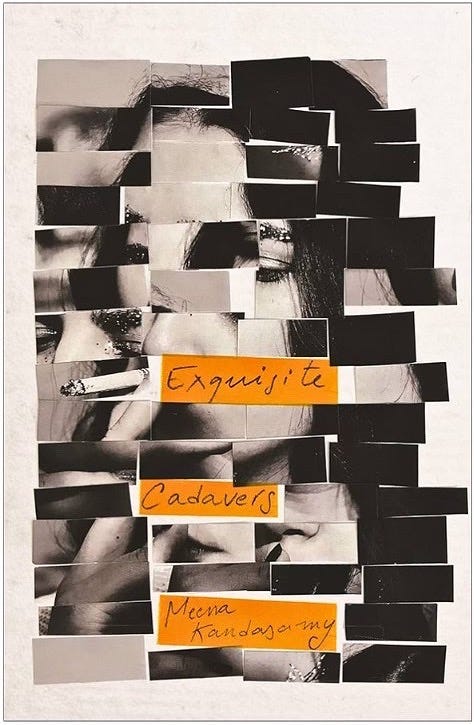
“The brief I was given was very open, stating that this is a bold piece of experimental fiction and they wanted a cover that reflects this (experimental, you say? Yes please!). I started as I usually do by reading the manuscript, which was vital in this case to understand the concept of the novel, and to see the marriage of footnotes and fiction. As I was reading, the main thing that kept running through my head was the idea of visually representing the unusual yet beautiful way the author created this novel. […] The whole process of working on this cover was very rewarding, it was one of few cases where I had absolute freedom to create and experiment, my favourite things, but without having to compromise on the final outcome; and of course, an author who falls in love with their cover at first sight is wonderful too!”
[Carmen R. Balit on the creative process of designing the hardback cover for Meena Kandasamy’s Exquisite Cadavers.]
Subtle and Shattering
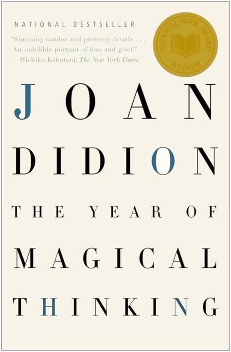
“There may be something to magical thinking. As I began to design this jacket, still under the spell of Joan’s manuscript, I began to arrange the lettering, and the name ‘John’ simply appeared to me. I hoped it would be a subtle way to honour him.”
[Carol Carson on designing the cover for Joan Didion’s The Year of Magical Thinking, a memoir about life after the sudden death of her husband, John. Quoted in The Look of the Book.]
Show Don’t Tell
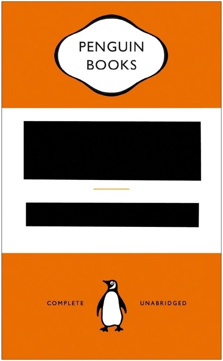
“I knew the idea wouldn’t work if the Penguin livery wasn’t in place. There would be no ‘way in’: nothing familiar or comforting to play against the starkness of the redaction. The book also needed to be well known to get away with this level of subversion: if potential buyers hadn’t read it, there would be a good chance they would still understand the messaging. (I liked how the ‘complete’ and ‘unabridged’ line made Penguin look somehow complicit in the spread of misinformation. I have to be grateful to them for allowing such brand abuse.)”
[David Pearson on his cover design for George Orwell’s 1984. Quoted in The Look of the Book.]
A Perfect Match
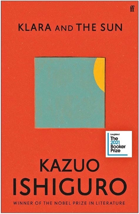
“I executed the cover in a painterly style, so it had a more childish/naïve feeling. It was important that there was a softness and a warmth to the cover, to match Ishiguro’s writing style. […] Better designers might have pulled out a brilliantly unexpected motif to represent on the cover but, for me, featuring the sun felt like the correct thing to do. It’s completely ubiquitous and speaks to all people. Klara’s relationship with the sun gives it an unusually playful character: it’s both a symbol and a protagonist.”
[Pete Adlington on designing the cover of Kazuo Ishiguro’s Klara and the Sun.]
Something Fresh From Something Old
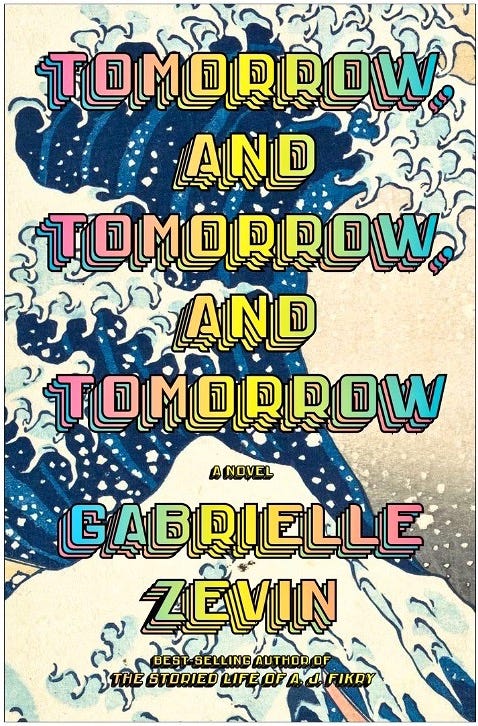
“Although this book takes place in the world of video game design, it is really, like most great books, the story of characters and relationships. The first challenge was to not be overt about the video game angle, yet I still wanted to retain the colour and energy of that world. The second challenge was self-imposed. Hokusai’s Great Wave painting. I did not want to go there. It has been reproduced ad nauseam, on posters, calendars, mugs, rugs, shower curtains, and likely other book covers. But since it was such an inspirational plot point, I had to give it a try. Miraculously, the incongruity of combining the splash-screen-inspired type with the centuries-old painting created something fresh and exciting that practically leaps off of the bookshelf.”
[John Gall on designing the cover for the hardback of Gabrielle Zevin’s Tomorrow, and Tomorrow, and Tomorrow.]
“[When] I was writing the novel, I once dreamed the cover, and it looked very close to this. So, I think John Gall, the cover designer, must have crawled into my dreams. (I still have never spoken to him.) […] At one point, the characters in the book discuss how The Great Wave is iconic to the point of being somewhat shopworn (it is described in the book as hanging in every dorm room in 1990s), so for this reason, I don’t think my waking self ever truly believed it would become the jacket’s imagery. The way the imagery is recontextualized by the 8-bit style type makes the whole thing feel incredibly fresh to me. When I look at the jacket, it feels exactly right. I love the mix of elements that evoke different eras and technologies.”
[Gabrielle Zevin, author of Tomorrow…, on her response to John Gall’s cover design.]
Back to the Beginning
When I was thirteen, I visited my aunt on Vancouver Island and we set off on a quest that ended with a dragon. She wanted to buy me a copy of Tolkien’s The Hobbit.
I specified (in the fussy, determined way of adolescents, who turn every youthful opinion into a worldview) that I didn’t like book covers with stills from movie adaptations or pictures of characters from the story. Both got in the way of my imagination, and my reading stumbled when my mental image of a character or scene in the story conflicted with the image on the cover.
My aunt and I searched through several bookstores before ending up at Munro’s Books, where we found the copy of The Hobbit that still sits on my bookshelf today. On its cover is a picture of Smaug the dragon.
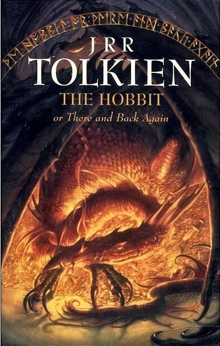
Despite contradicting my no-characters rule, I loved this cover. Holding that paperback in my hands, I anticipated the adventure it contained. I looked at the sleeping beast, curled inside his terrifying wingspan, glowing with internal rage that illuminates his mountain of gold, and I felt like Bilbo Baggins. Just like the hobbit preparing to enter Smaug’s lair, I braced to enter the book. The dragon on the cover did two things: warned me of the danger inside and invited me into it.
That cover was my first lesson in good design — that sometimes the obvious choice is the right choice — and helped me see there’s only one rule that applies in all cover design: never judge a book by its cover, sure, but always judge a cover by its book.
When Your Favorite Writer Does Not Like Your Initial Cover Designs by Na Kim in Literary Hub.